• Skip to primary navigation
  • Skip to main content
  • Skip to primary sidebar
  • Skip to secondary sidebar

IRL Experience Design

  • Best Of
  • My Work
  • About
  • Austin Experiences
    • 60+ Weird Things To Do In Austin
    • The Top 13 Immersive Experiences in Austin, Texas
    • 45+ Unique Things To Do in Austin (A local’s guide)
    • Things to Do in Austin When it Rains
    • 5 Fun & Unique Austin Team Building Activities for Small Teams
    • Austin Halloween Guide
    • Austin Christmas Guide
    • Austin Easter Guide
  • Contact

Satin vs Brite Anodized Aluminum Finishes

April 19, 2022

I don’t post a lot of “gritty details” on the blog, but occasionally I like to share things I had to learn the hard way (i.e., I couldn’t find it with Google) in hopes of helping someone else struggling to find the same answer. This is one of those posts.

The U channels of The Eureka Room are aluminum. We are upgrading the room for safety and I was shopping for new channels. They come in a lot of finishes. To look at the photos on distributor’s website, they all look about the same shade of grey. Reflectivity is not easy to show. Even the “white” options look pretty dull. And many of them looked like they were actually 3D renderings, not photos of real parts.

So I ended up ordering some samples, which of course took some money and time that I’d rather not have spent.

I received three samples: “white”, “brite anodized”(sic), and “satin anodized”.

A photo is worth a thousands words, so here they are.

From left to right: “brite”, “satin”, and “white”

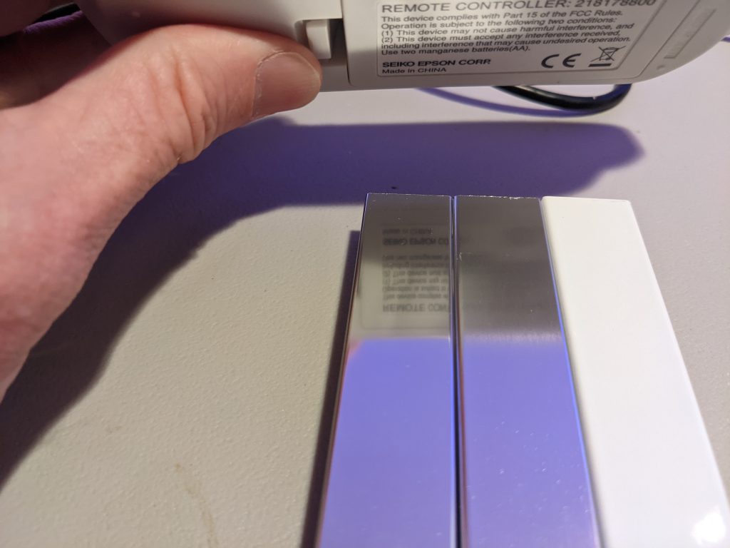
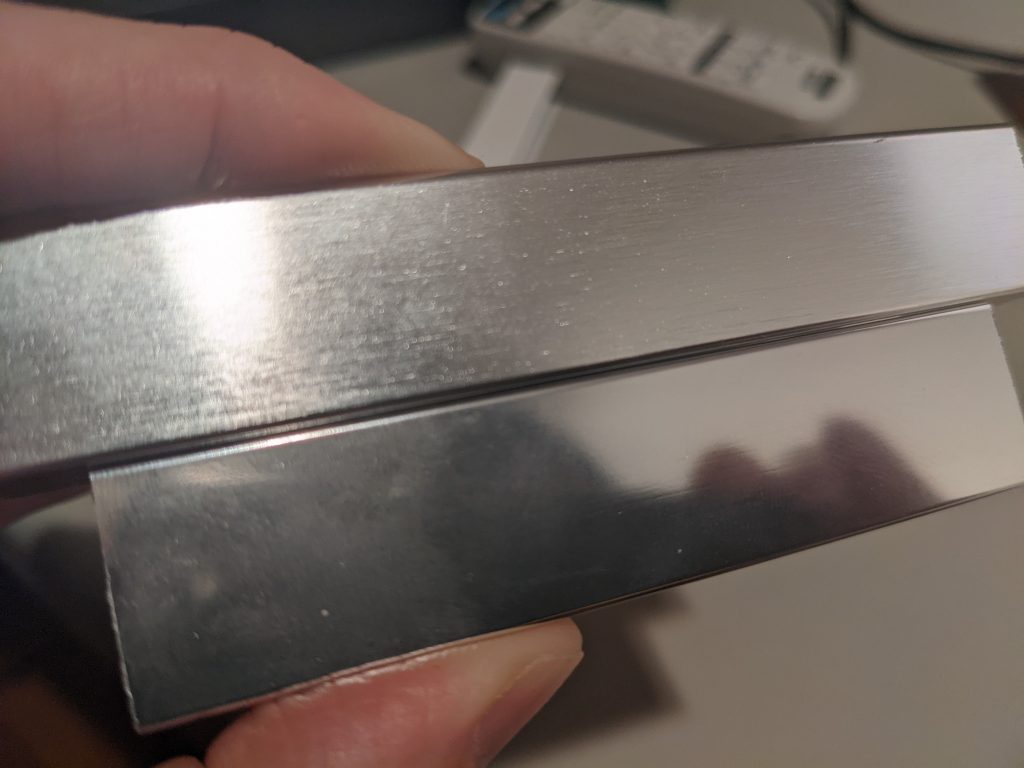
As you can see, the “brite” is relatively mirror-like but the “satin” blurs the text.

What about when I put next to the Eureka Room’s 14,000 LED’s?

From top to bottom: “white”, “satin”, and “brite”

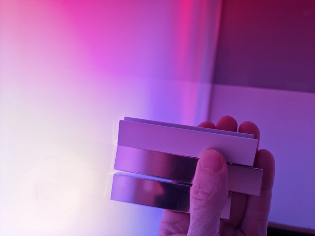
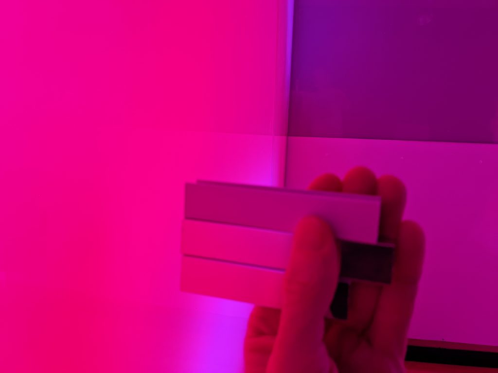
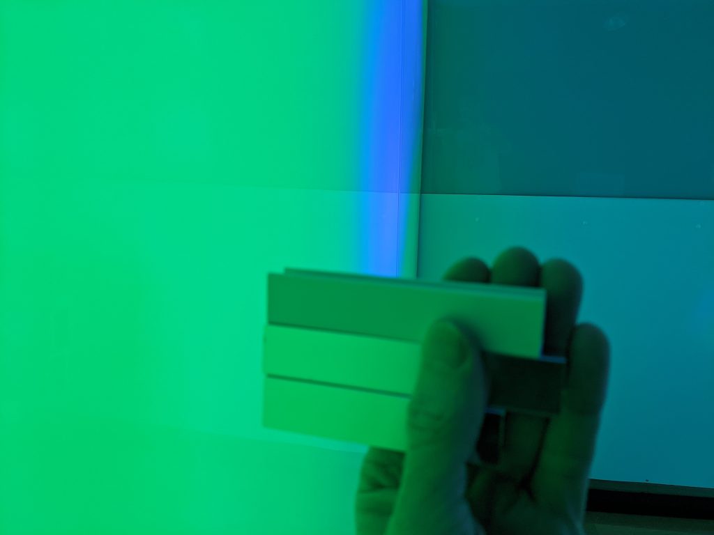
You can see above that the white doesn’t reflect as much light as the others. It looks downright dark, in fact. While it looks nice in the white room with the white lights on in the room (see the top photo in the post), it stands out as dark when the colored lights are on. The other two look generally the same, but If there is text on the front screen I don’t want it to be mirrored, so I’ll go with Satin.

Let’s take a close up look at satin vs brite. You can see that the satin is not as shiny as the brite:

Top: “satin” Bottom: “brite”

I hope this helps you. Check out The Eureka Room while you’re here!

Share this:

  • Click to share on X (Opens in new window) X
  • Click to share on Facebook (Opens in new window) Facebook
  • Click to share on LinkedIn (Opens in new window) LinkedIn
  • Click to share on Reddit (Opens in new window) Reddit

Posted Under: Everything Else

Primary Sidebar

About Me

I make awesome experiences for people. Read More

Search my blog

Generic selectors
Exact matches only
Search in title
Search in content
Post Type Selectors

See My Favorite Books

  • For IRL XD
  • For Learning
  • For Getting Things Done

@IRL_Experience_Design

instaglogo

Secondary Sidebar

See My Halloween Event Guide Featuring Halloween events for over 1000 cities!

A cute ghost holding a map of Halloween Events

See My Holiday Event Guide Featuring Holiday events for over 1000 cities!

A cute elf holds a map of Christmas and holiday events around the city.

VISIT MY BOUTIQUE IMMERSIVE EXPERIENCE

SEE MY AUSTIN EVENTS WALL CALENDAR

Austin Events and Things to Do 2025 Wall Calendar Cover

Read My Recent Posts

  • Bulk Cold Emailing For Beginners
  • IRLXD Update 9/12/2024
  • Eureka Room Update 6/18/2024
  • A Creator’s Trap: Confusing the Joy of Creating with the User Experience
  • Lessons Learned: Don’t fall in love with a challenge that does not need taken on.
  • Where to find 1000’s of books on creating successful experiences
  • Designing With Experiential Modes (Part 2)

  • Contact
  • About
  • Privacy Policy