Note: This post was drafted on 7/14/2021 and finalized today.
I’ve been putting a lot of time into The Eureka Room lately, so thought I would share what I’ve been up to. Loads of spoilers in here so you might want to skip this if you haven’t been over here to see it recently.
The End to End Experience
Up until now the experience of the Eureka Room has been limited to the programs in the room.
But the full experience of something includes everything from when you first hear about it until you finally forget it ever happened.
I had an OK website that added to the experience, but hadn’t focused much on the other touchpoints and interactions. I’ve had some foggy ideas on what each step along the way might look like, though. I decided to write them out and examine them more closely.
You don’t have to read my sloppy handwriting, but you can get a feel for how many things are involved from this photo. That is the left column. Only one line of that chart represents the experience people were getting – the part that says “ER”.
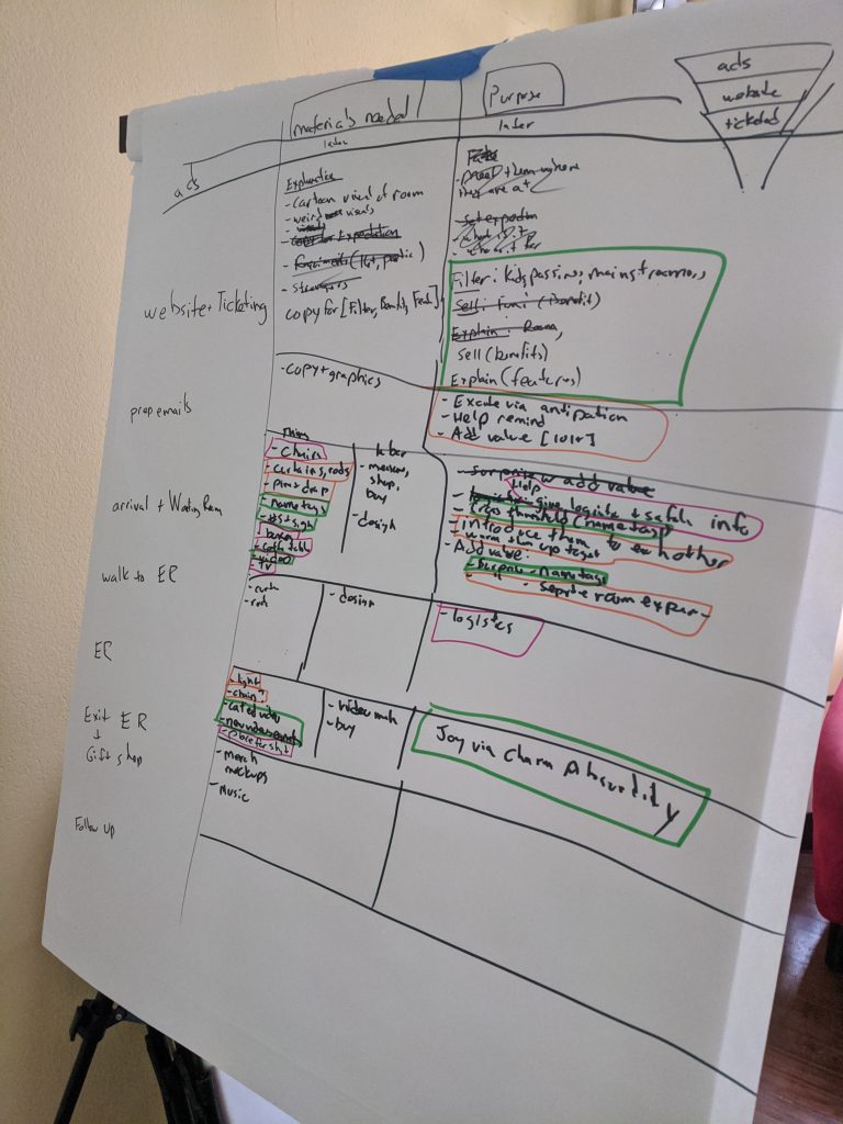
I went through each row in that left column and wrote down both the purpose and the materials I thought were involved in that stage.
The next crucial part is to remember the mission and get it in my head solid so that I can litmus test these ideas.(The mission is “To help people feel joy through charming absurdity”). I can not stress enough that you should have a well-thought out mission.
Once I felt I had the mission lens in place, I looked at each item and asked “is this on mission?”
For example, I had a vision of a red-curtained waiting room. Classy and mysterious, right? But when I asked “Is this charming absurdity?” the answer was clear: No. It’s not. And I knew I needed something else.
In fact, that night I had a gig at the Ballroom, which happens to be covered in red curtains. Here’s a photo I took that night:
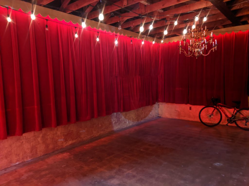
This isn’t “charming absurdity”. This is more theatrical. Or possibly a creepy “red room” a la David Lynch. It was not going to work for my mission.
As with the curtains, I walked through each item on the list and colored them according to how much “charming absurdity” they had. The results showed me where I needed to revisit. Green meant on mission, orange meant sorta of on mission, purple was not at all on mission or perhaps a logistical need where there might be opportunities to add more mission-oriented value.
Consistency
My vision for years is that that the entire Eureka Room experience appear to be automated. I’d love people to walk up to a building, swipe a credit card, the door unlocks, they enter, have the experiences, leave, door locks, the end. No human interaction at all. Just a strange alien building they visited.
There are some reasons I don’t think I want to do this full vision but I do think it’s more fun and mysterious (and consistent) if I can take the human element (currently: me) out of the e2e experience.
The first reason for this is that my personality and the visitors’ interpretation of my personality color the experience in ways that really aren’t supposed to be part of the experience. Some nights I’ve been tired and have trouble bringing the energy. Sometimes I feel nervous. Performing is not my strong suit nor an interest of mine. I need to focus on my strengths and have more predictability.
The second reason is that there were a lot of parts that I’ve been ad-libbing. I would forget things, ramble too long, be unclear, etc. Visitors deserve a consistent and clear experience. Yes, I could learn exactly what to say, but like I said, I have no interest in being an actor.
More consistency allows me to feel confident visitors are getting what they expected to get.
Each Part of the Experience – A Walkthrough
Let me walk you through the before and after of each part, in the order you would experience them. I’ll comment on what I’ve tried, what didn’t work, and things I’m trying now. Oh, also – photos!
The Finding Out
Before the website part of the experience is the “find out about it” part of the experience. This means ads, PR, word of mouth, etc.
I plan on working on this part soon but don’t have much to say on it right now. Let’s move on to the website…
The Website
I wanted the website to be mysterious and inviting. It was mysterious. Too much so. I realized that needed to share more about the room. I didn’t want people showing up thinking it was a Meow Wolf sized deal. I also didn’t want people who would have otherwised loved to visit to get the wrong impression from the vague description, (eg, think it was a rinky-dink thing, or an escape room, or just generally feel unsure if it was for them).
I have updated the website with more language that I hope makes it much clearer the tone and what happens. One big important word turned out to be “participatory”. Some people love participation and some absolutely dread it. I use that word to help people sort themselves out before they ever buy tickets.
I also draw attention to the size of the room. It is boutique. It is special. It is not a giant room filled with projections that stuffs in hundreds of people. This is a special and limited experience for a specific type of person that wants an experience that is more intimate and cozy.
I’m going to add some photos of the room to the website. Doing this was exceptionaly hard for me to change my mind on. I have been thinking that the ultimate spoiler is to see the room. But honestly, that surprise is given away the first second you walk in so what’s the big deal? Showing it is a great way to set expectations correctly, even if personally I would love to go some thing that was absolutely unclear in what it was. I might “cartoonify” or rotoscope some of the photos so that you get the feel and idea but it still has a veneer of mystery. We’ll see.
Booking A Time To Visit
Previously to visit you would email me and we’d go back and forth until we set up a time.
The experience for the visitor went from “mysterious website” to “setting up a time with some dude”. I wasn’t always mysterious in my emails, sometimes not very clear, often short and business-like, and generally “out of character” and “off mission” compared to the website. I’ve got my day job stuff to take care of and it was hard to field these emails. I’m know I turned some people off.
I needed to take me out of these interactions and automate the booking process (for the most part). I asked my advisor, former-escape room co-owner Mehul, and he suggested bookeo (not to be confused with bookio). With a little work I was able to get bookings listed on the website.
Prep Emails
This is the part that is after the booking but before the arrival. Communication before the visit will be handled by Bookeo (with my watching) and I hope to add more value into this stage. It’s a lower priority than the other stages because I don’t think there’s anything that visitors will be expecting beyond logistical information, anyways. (Though that does mean potential fertile ground for exceeding expectations and delivering surprise).
The Arrival
The Eureka Room currently lives at my house as I work out the details and look for a commercial location. Currently people just park on the street and knock on my door and I let them in. If I think ahead enough I’ll hanging a business card on the front door so they know they have the right place.
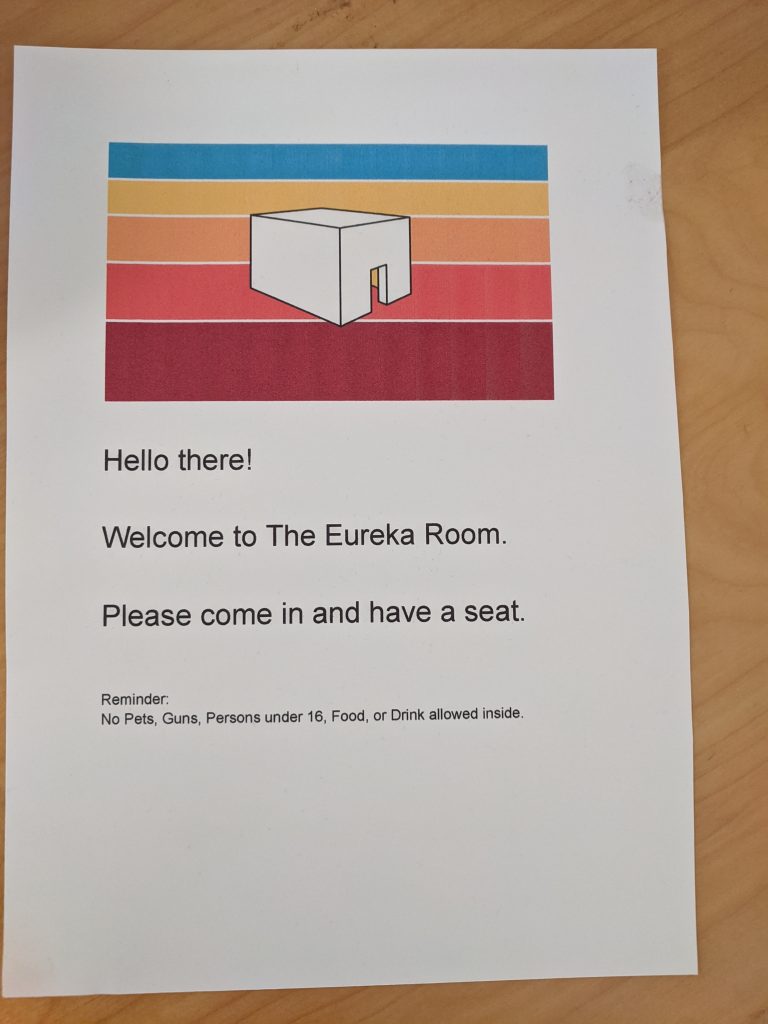
I don’t want to put a lot of work into this, since it is site-specific and I’ll be moving. But I need the striped logo out front as a throughline that they connect from the website. It might also be a nice professional sign so that it looks more legit.
Here’s a paper version I used.
The welcome mat was looking bad and I came across one that had Eureka Room-type stripes. So I added that in as well.
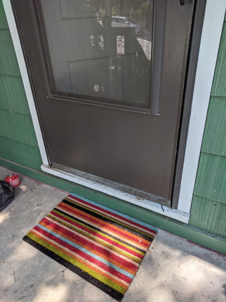
I am purposely asking them to come in and sit down in the waiting room. This is to eliminate the variability of the host (me) and also to make it a little more mysterious.
The Waiting Room
Previously, I would answer the door and welcome them into a recently un-disheveled but still sort of dishelved living room. You could see my treadmill, my guitars, my tv, etc. On the one had, this was interesting to people because “this thing is in some guys’ house!” but on the other hand it’s not charming absurdity yet. The experience sort of only existed in the ER itself (which is a separate room).
I knew having a second room would be a good ROI: a second “experience”. The room could have it’s own experience or just be it’s own experience. That way I could extend the experience about 10-15 minutes for very little cost. Everybody wins.
Well, everybody except my living room, which is yet another part of my house that has now been sacrificed for my work. Oh well. In for a penny, in for pound.
I gave a lot of thought to what the Waiting Room might look like – and be on mission – and decided I have a few throughlines with the ER:
- Charming absurdity.
- The natural world. Birds, cricket sounds, fruits and vegetables, etc.
- Really crappy Microsoft Paint – styled sketches.
In particular, I lean away from the “futuristic” and “glitchy” tech-styled immersive experiences. So I decided what would be more surprising and absurd and natural then walking into a room of plants?
I bought a bunch of different nature prints and decided on some palm leaves. I’d use the benches from the ER (have to get more seats for there, I guess….), keep the TV in the waiting room, and use the curtains to section off part of my living room.
So you would walk in and see something like this:
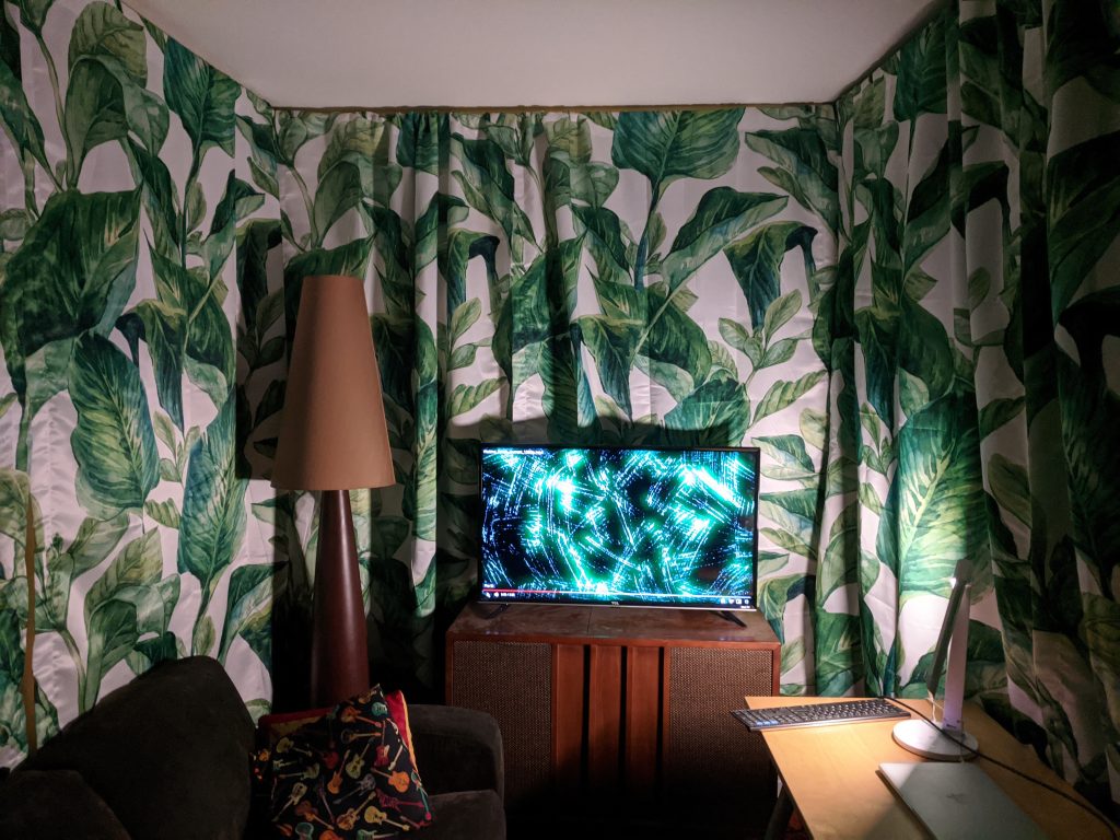
In the above photo I still have my couch and desk, but those would be replaced with two benches. I debated having the TV attached to the wall and hidden behind the curtain, but ultimately didn’t think people would care because for god’s sake they just walked into a rain forest who cares where the tv is?
I created a video with voiceover that explains all the things I wanted to communicate to people. It also was weird and hopefully funny. I loaded it with compliments because people like compliments.
So here’s what happens
You walk into this and no one is there. There is brazillian jazz playing. It’s soothing. The TV says please have a seat and we’ll start shortly. It will have the logo (to continue that throughline).
I’m sitting behind the curtain. Once everyone is there I start the video. The video is about 5 minutes long, which allows any late arrivals a few more minutes (since you don’t need to watch the video really).
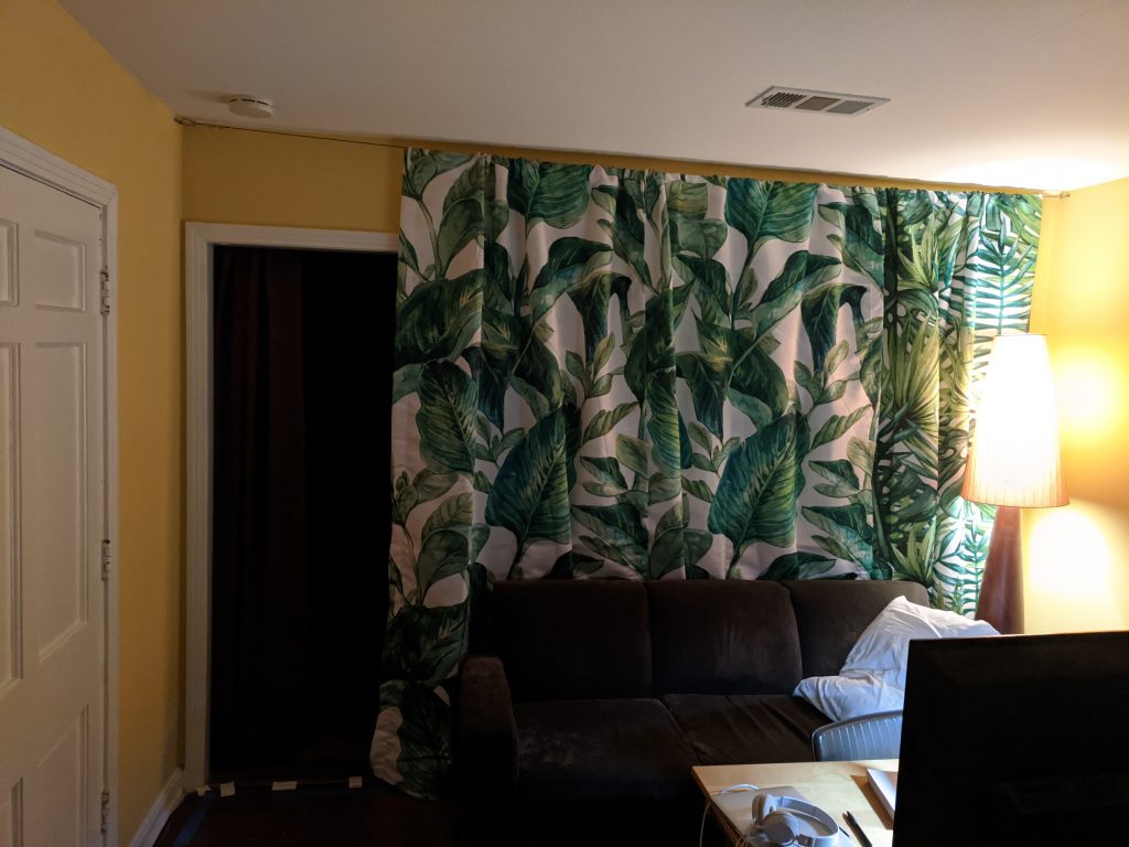
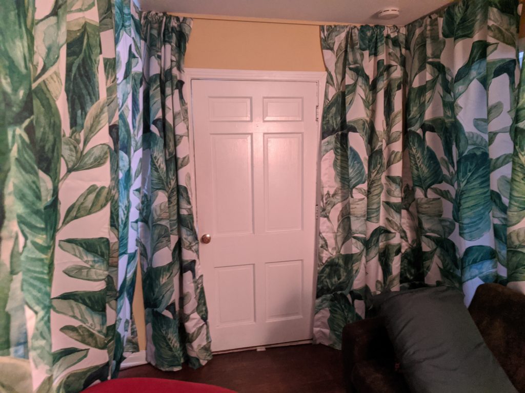
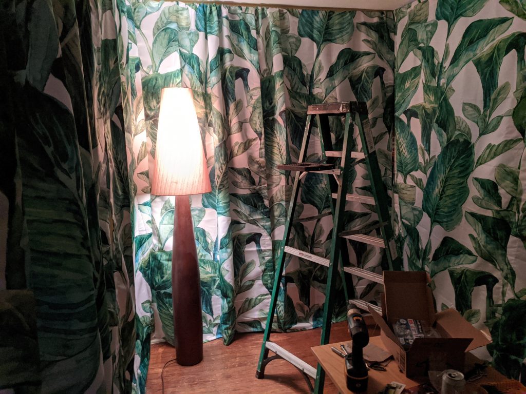
Here’s a few more photos for you:
From the Waiting Room to the Eureka Room
The video ends saying that the attendant (me) will be in to answer and questions and lead them to the room. I don’t think at this time I can completely cut me out of it since people have concerns – restroom for example – that I will have to attend to.
From there I lead them to the ER room. Unfortunately this is not as easy as just opening the curtain and letting them walk in. There’s about 12 feet they have to walk through my living room to get there. So instead of showing “behind the curtain” literally, I built a tunnel they walk through.
The tunnel is basically two wires with a sheet thrown over it. It goes from a break in the curtain of the Waiting Room to the doorway of the ER Room. This was a pain to build and design. Since they are only in it for about 10 seconds, it’s probably the lowest ROI of all the changes. I don’t think it’s worth making cooler since, again, this whole thing is moving sometime soon I hope. (I do hope to keep the same idea of the waiting room, though).
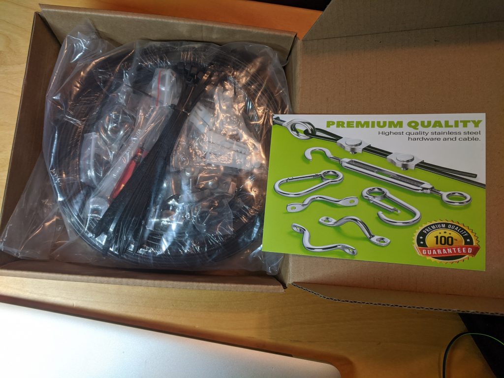
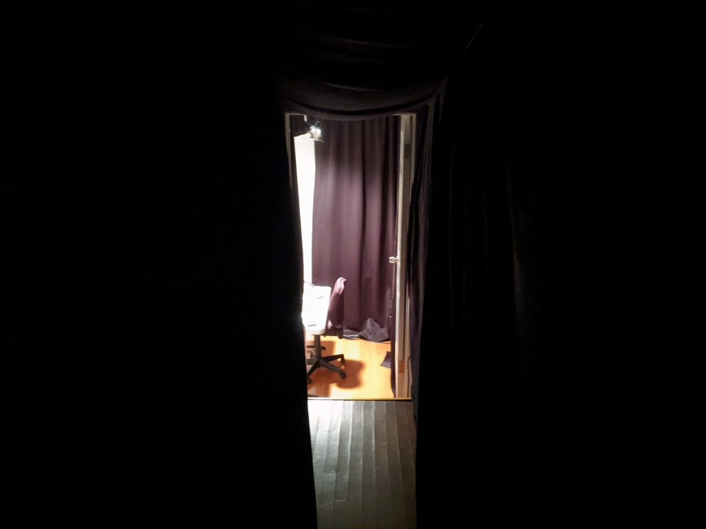
The tunnel was so narrow that I bought some dow rods and t-shaped pipe fittings to keep the wires from coming together. It’s way better now.
The Eureka Room Room
Yeah, I know “Eureka Room Room” sounds redundant, but it’s also clear what I mean, I hope.
Previously, people would enter and sit, then I would reach behind the curtain and play the first program. I would turn out the light, leave, and then wait until I heard it was over. At which point I would go into the room, ask them to go out of the room, and set up for the next program.
Instead I want the only times that I am in the room is to start it and to let them out after all programs are finished.
This required many things. On the video side of things, I needed to create a new intro and outro to the whole collection of programs, and transitions between programs. I tried so many ways to do this and really struggled. Should it be big and booming and impressive at first? Or should it be understated? How long should it be? What themes do I use? How do I weave in the natural world and charming absurdity? Do I include the crappy drawings?
I settled on short and sweet. It’s mostly a reorganization of the intro I used for EAST, but I change a few things. Most notably changed is the font. Instead of the bold (somewhat overused) font I was using, I switched to a sort of hand-drawn font. This, I hope, echoes the style of the drawings and says “Hey – this is homemade by a real person”. I also used a star field and cricket sounds to create a sort of calming reset between programs. This “hey it’s like camping at night” look also can inspire some awe. At the very least it’s probably surprising for people to hear crickets in this high tech space.
Another challenge in the room is that sometimes you are sitting and sometimes you are standing and sometimes there’s a table in the room with stuff on it. If I wasn’t going to be in there, how does this stuff magically move around?
I haven’t quite worked this out, but my current thought is: Tom Sawyer it. Make it fun for them to do this work that I don’t want to do. Get a nice fancy mystery trunk and put all the parts in there. People love “unboxing” – I’ll dress up the work as “unboxing”. Added surprise for them, less work for me.
Unfortunately, the room is pretty tight and moving things around might result in them banging up the walls. I’ll probably just put a part in the video that says “wait for the attendant”. Then I’ll go in silently and move things around. Mehul suggested that I give them something fun to do in the meantime, which I think is a good idea but I’m not sure if that will happen in this current phase.
Other work included: reorganizing the room and moving the computer, buying some furniture getting rid of other furniture, shopping for seating that feels connective, roomy and doesn’t take up room (very tricky).
Exit To The Gift Shop
Until now, when the last program ended, I would go in the room, turn the light on and lead them to the living room where we would hang out some. Often this was awkward. Sometimes I got great feedback. Sometimes I got great compliments. But I never really knew what to do (because it wasn’t a priority just yet). Eventually they would start to leave and I would ask them to tell their friends, perhaps giving them a business card.
Generally it was a pretty poor close, experience-wise.
So now…
They will go back through the tunnel into the waiting room, which is now a gift shop. I have moved some furniture around and have a table set up showing off the things they can buy. The lighting is different. Some of the curtains are parted and there’s a sign that says Eureka Room Gift Shop. Many people have asked for stickers or shirts and I currently have nothing to offer them but my business card.
Additionally I want:
- To offer ways they can stay in touch. An electronic or paper way to sign up for the newsletter. Perhaps a way to refer friends.
- To ask for online reviews (whenever this is ready).
- To solicit feedback and see what worked the best and if there were points of confusion or frustration.
The gift shop has two main goals: First, extend their experience even further by stayign in touch and/or taking home a souvenir. Second, ask the people who loved it to help me get more business, either through referrals of friends or through purchases in the gift shop.
The gift shop idea is something I’ll best be able to develop as people visit the gift shop. I’m sure it will change from what I’ve posted here but I think it’s a good first stab.
Final Exit
This part is to be developed. Right now we just say goodbye and they leave. Perhaps something more memorable and dramatic can happen to signal “back to the real world now”.
There’s also the newsletter and other ways to continue their experience and stay connected. This also is lower priority right now.
What’s Next
There’s still a lot to do but I hope that this overview of the End-to-End experience of The Eureka Room gives you a better idea of what I’m aiming for. I’d love to have you visit and tell me your thoughts. Get tickets at EurekaRoom.com