Note: this post was drafted on 6/24/2021 and finalized today.
Current Status of The Eurkea Room
The new design for the end-to-end Eureka Room experience now has a waiting room with a tropical feel. It’s mellow bossa-nova-esque. Visitors watch a video that explains the logistics and then we go down a tunnel into the Eureka Room. I’ve very excited that I’m adding some more pizazz to the Eureka Room experience and to be able to be considering the whole experience: from when they first learn about it until they forget they ever went.
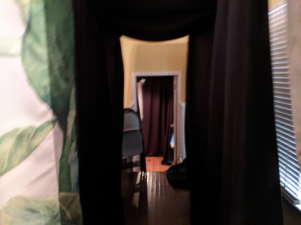
So when they go down the tunnel (the tunnel is just a 10 foot long sheet over two wires, created so that they don’t have to see my living room and personal stuff), the anticipation is built up pretty good.

Ideally, I’ve got them thinking “Alright! We’re doing it!” as they eagerly take their places in the Eureka Room.
At this point, in the EAST version, the lights go out. The logo appears on the front screen and an airlock sound, it extends out to the edges of the room. Then goes dark again. Then each panel lights up yellow as it dings and the logo comes back. Then it’s over.
It’s ok. But it’s really basic and a little too short. It’s basically “bam! you’re in the Eureka Room. Here’s the first program”.
For the amount of buildup I’ve done with people in the waiting room, I think I need something more spectacular. I need to “awe them and honor them” as Priya Parker says.
I think most people come into the room expecting to be wowed. I need to give them some wow. More moving lights. Maybe the panels stay solid but drift up. Or maybe it’s a Turkey Volcano thing where stuff comes at them “3D” from the front screen outward.
And then there’s the sounds/music. That is what I got hung up on last night.
The Eureka Room Intro Music
What would this intro music sound like? I sat down at the keyboard and started to experiment. I went through many, many instrument tones and effects as well as musical styles., but I kept struggling. I dug through my pile of unused material. Nothiing jumped out at me.
The problem I kept having was that the music was too catchy. Well to me, at least. Even not to you, it still all has a feeling like it is going somewhere. Each song has a melody that calls for the next part.
Usually it’s good to be catchy, but if it has a beat and a good melody, then they get into it. After 15 seconds (the length of my envisioned intro) they might be really into it. And then…
And then I take it away from them in order to start the show. Like a podcast or radio show with a good intro song that is cut off by somebody talking. It’s pulling the emotional rug out from under my ears.
But there IS good intro music, right? I think of the production company bumpers in movies. A quick flare of trumpets or some other obviously-this-will-be-short music that ends where you want it to end.
So that’s my discovery of the day. Intro music is different than intro song. In fact, there’s a few ways I can create the intro:
- Self contained “song” that has a clear resolution it is heading toward so it doesn’t feel “cut off”.
- Musical notes (like I currently have with the yellow panels. Think of NBC’s ding ding ding)
- Sound effects that lack musical quality.
- Silence. This can be more dramatic than you might think. I picture the beginning of a Paramount movie as the stars wrap the top of the mountain in silence (or as the beginning audio of the first scene drops in)
The New Version
The new version does this:
- The 4 yellow panels go ding ding ding ding.
- The logo drops in. The font is now changed from “jurassic park” to a sort of hand-written printing that evokes the sort of MS Paint-styled drawings in the program. It also says (I hope): “This is local and homemade and special” and “This isn’t going to be perfect”.
- From there it all fades away into a slow moving starfield appears and you hear the sound of crickets. This is to inspire a bit of associated awe and relax and hopefully reset people. The same handwritten font shows them which programs they will be seeing. Then the first program is written larger on its own so that you know that THAT program is happening next.
- This starfield, crickets, and font are also used between programs as a “reset” and familar throughline. A sort of visual docent, if you will.
So yeah, ultimately I didn’t do music at all. I decided the “wow” can be this faux-camping nature universe vibe. It also continues one of the overarching themes of the Eureka Room: the natural world. I mean what’s more wow than the universe?
Maybe I’ll have some music come to me in the future, but honestly I like this. Simple and unassuming and a good juxtaposition with the craziness of the programs. Plus it will work with literally anything, like black shoes.
During my investigation I did come up with some great music that I want to use for new passive programs. So.. bonus!